b
props.children and proptypes
Displaying the login form only when appropriate
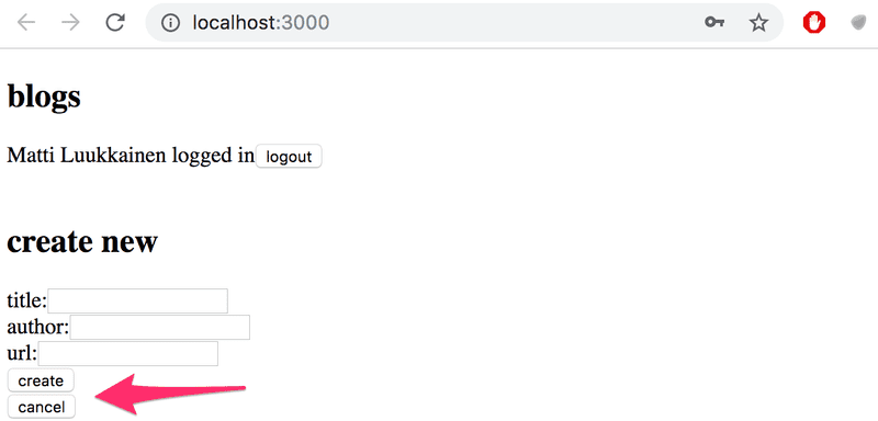
Let's modify the application so that the login form is not displayed by default:
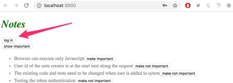
The login form appears when the user presses the login button:
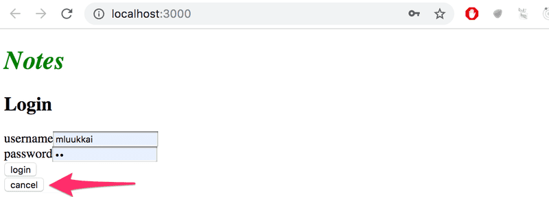
The user can close the login form by clicking the cancel button.
Let's start by extracting the login form into its own component:
const LoginForm = ({
   handleSubmit,
   handleUsernameChange,
   handlePasswordChange,
   username,
   password
  }) => {
  return (
    <div>
      <h2>Login</h2>

      <form onSubmit={handleSubmit}>
        <div>
          username
          <input
            value={username}
            onChange={handleUsernameChange}
          />
        </div>
        <div>
          password
          <input
            type="password"
            value={password}
            onChange={handlePasswordChange}
          />
      </div>
        <button type="submit">login</button>
      </form>
    </div>
  )
}

export default LoginForm
The state and all the functions related to it are defined outside of the component and are passed to the component as props.
Notice that the props are assigned to variables through destructuring, which means that instead of writing:
const LoginForm = (props) => {
  return (
    <div>
      <h2>Login</h2>
      <form onSubmit={props.handleSubmit}>
        <div>
          username
          <input
            value={props.username}
            onChange={props.handleChange}
            name="username"
          />
        </div>
        // ...
        <button type="submit">login</button>
      </form>
    </div>
  )
}
where the properties of the props object are accessed through e.g. props.handleSubmit, the properties are assigned directly to their own variables.
One fast way of implementing the functionality is to change the loginForm function of the App component like so:
const App = () => {
  const [loginVisible, setLoginVisible] = useState(false)
  // ...

  const loginForm = () => {
    const hideWhenVisible = { display: loginVisible ? 'none' : '' }
    const showWhenVisible = { display: loginVisible ? '' : 'none' }

    return (
      <div>
        <div style={hideWhenVisible}>
          <button onClick={() => setLoginVisible(true)}>log in</button>
        </div>
        <div style={showWhenVisible}>
          <LoginForm
            username={username}
            password={password}
            handleUsernameChange={({ target }) => setUsername(target.value)}
            handlePasswordChange={({ target }) => setPassword(target.value)}
            handleSubmit={handleLogin}
          />
          <button onClick={() => setLoginVisible(false)}>cancel</button>
        </div>
      </div>
    )
  }

  // ...
}
The App components state now contains the boolean loginVisible, which defines if the login form should be shown to the user or not.
The value of loginVisible is toggled with two buttons. Both buttons have their event handlers defined directly in the component:
<button onClick={() => setLoginVisible(true)}>log in</button>

<button onClick={() => setLoginVisible(false)}>cancel</button>
The visibility of the component is defined by giving the component an inline style rule, where the value of the display property is none if we do not want the component to be displayed:
const hideWhenVisible = { display: loginVisible ? 'none' : '' }
const showWhenVisible = { display: loginVisible ? '' : 'none' }

<div style={hideWhenVisible}>
  // button
</div>

<div style={showWhenVisible}>
  // button
</div>
We are once again using the "question mark" ternary operator. If loginVisible is true, then the CSS rule of the component will be:
display: 'none';If loginVisible is false, then display will not receive any value related to the visibility of the component.
The components children, aka. props.children
The code related to managing the visibility of the login form could be considered to be its own logical entity, and for this reason, it would be good to extract it from the App component into a separate component.
Our goal is to implement a new Togglable component that can be used in the following way:
<Togglable buttonLabel='login'>
  <LoginForm
    username={username}
    password={password}
    handleUsernameChange={({ target }) => setUsername(target.value)}
    handlePasswordChange={({ target }) => setPassword(target.value)}
    handleSubmit={handleLogin}
  />
</Togglable>
The way that the component is used is slightly different from our previous components. The component has both opening and closing tags that surround a LoginForm component. In React terminology LoginForm is a child component of Togglable.
We can add any React elements we want between the opening and closing tags of Togglable, like this for example:
<Togglable buttonLabel="reveal">
  <p>this line is at start hidden</p>
  <p>also this is hidden</p>
</Togglable>
The code for the Togglable component is shown below:
import { useState } from 'react'

const Togglable = (props) => {
  const [visible, setVisible] = useState(false)

  const hideWhenVisible = { display: visible ? 'none' : '' }
  const showWhenVisible = { display: visible ? '' : 'none' }

  const toggleVisibility = () => {
    setVisible(!visible)
  }

  return (
    <div>
      <div style={hideWhenVisible}>
        <button onClick={toggleVisibility}>{props.buttonLabel}</button>
      </div>
      <div style={showWhenVisible}>
        {props.children}
        <button onClick={toggleVisibility}>cancel</button>
      </div>
    </div>
  )
}

export default Togglable
The new and interesting part of the code is props.children, which is used for referencing the child components of the component. The child components are the React elements that we define between the opening and closing tags of a component.
This time the children are rendered in the code that is used for rendering the component itself:
<div style={showWhenVisible}>
  {props.children}
  <button onClick={toggleVisibility}>cancel</button>
</div>
Unlike the "normal" props we've seen before, children is automatically added by React and always exists. If a component is defined with an automatically closing /> tag, like this:
<Note
  key={note.id}
  note={note}
  toggleImportance={() => toggleImportanceOf(note.id)}
/>
Then props.children is an empty array.
The Togglable component is reusable and we can use it to add similar visibility toggling functionality to the form that is used for creating new notes.
Before we do that, let's extract the form for creating notes into a component:
const NoteForm = ({ onSubmit, handleChange, value}) => {
  return (
    <div>
      <h2>Create a new note</h2>

      <form onSubmit={onSubmit}>
        <input
          value={value}
          onChange={handleChange}
        />
        <button type="submit">save</button>
      </form>
    </div>
  )
}
Next let's define the form component inside of a Togglable component:
<Togglable buttonLabel="new note">
  <NoteForm
    onSubmit={addNote}
    value={newNote}
    handleChange={handleNoteChange}
  />
</Togglable>
You can find the code for our current application in its entirety in the part5-4 branch of this GitHub repository.
State of the forms
The state of the application currently is in the App component.
React documentation says the following about where to place the state:
Often, several components need to reflect the same changing data. We recommend lifting the shared state up to their closest common ancestor.
If we think about the state of the forms, so for example the contents of a new note before it has been created, the App component does not need it for anything. We could just as well move the state of the forms to the corresponding components.
The component for a note changes like so:
import { useState } from 'react'

const NoteForm = ({ createNote }) => {
  const [newNote, setNewNote] = useState('')

  const addNote = (event) => {
    event.preventDefault()
    createNote({
      content: newNote,
      important: true
    })

    setNewNote('')
  }

  return (
    <div>
      <h2>Create a new note</h2>

      <form onSubmit={addNote}>
        <input
          value={newNote}
          onChange={event => setNewNote(event.target.value)}
        />
        <button type="submit">save</button>
      </form>
    </div>
  )
}

export default NoteForm
NOTE At the same time, we changed the behavior of the application so that new notes are important by default, i.e. the fiedl important gets the value true.
The newNote state attribute and the event handler responsible for changing it have been moved from the App component to the component responsible for the note form.
There is only one prop left, the createNote function, which the form calls when a new note is created.
The App component becomes simpler now that we have got rid of the newNote state and its event handler. The addNote function for creating new notes receives a new note as a parameter, and the function is the only prop we send to the form:
const App = () => {
  // ...
  const addNote = (noteObject) => {    noteService
      .create(noteObject)
      .then(returnedNote => {
        setNotes(notes.concat(returnedNote))
      })
  }
  // ...
  const noteForm = () => (
    <Togglable buttonLabel='new note'>
      <NoteForm createNote={addNote} />
    </Togglable>
  )

  // ...
}
We could do the same for the log in form, but we'll leave that for an optional exercise.
The application code can be found on GitHub, branch part5-5.
References to components with ref
Our current implementation is quite good; it has one aspect that could be improved.
After a new note is created, it would make sense to hide the new note form. Currently, the form stays visible. There is a slight problem with hiding the form. The visibility is controlled with the visible variable inside of the Togglable component. How can we access it outside of the component?
There are many ways to implement closing the form from the parent component, but let's use the ref mechanism of React, which offers a reference to the component.
Let's make the following changes to the App component:
import { useState, useEffect, useRef } from 'react'
const App = () => {
  // ...
  const noteFormRef = useRef()
  const noteForm = () => (
    <Togglable buttonLabel='new note' ref={noteFormRef}>      <NoteForm createNote={addNote} />
    </Togglable>
  )

  // ...
}
The useRef hook is used to create a noteFormRef ref, that is assigned to the Togglable component containing the creation note form. The noteFormRef variable acts as a reference to the component. This hook ensures the same reference (ref) that is kept throughout re-renders of the component.
We also make the following changes to the Togglable component:
import { useState, forwardRef, useImperativeHandle } from 'react'
const Togglable = forwardRef((props, refs) => {  const [visible, setVisible] = useState(false)

  const hideWhenVisible = { display: visible ? 'none' : '' }
  const showWhenVisible = { display: visible ? '' : 'none' }

  const toggleVisibility = () => {
    setVisible(!visible)
  }

  useImperativeHandle(refs, () => {    return {      toggleVisibility    }  })
  return (
    <div>
      <div style={hideWhenVisible}>
        <button onClick={toggleVisibility}>{props.buttonLabel}</button>
      </div>
      <div style={showWhenVisible}>
        {props.children}
        <button onClick={toggleVisibility}>cancel</button>
      </div>
    </div>
  )
})
export default Togglable
The function that creates the component is wrapped inside of a forwardRef function call. This way the component can access the ref that is assigned to it.
The component uses the useImperativeHandle hook to make its toggleVisibility function available outside of the component.
We can now hide the form by calling noteFormRef.current.toggleVisibility() after a new note has been created:
const App = () => {
  // ...
  const addNote = (noteObject) => {
    noteFormRef.current.toggleVisibility()    noteService
      .create(noteObject)
      .then(returnedNote => {
        setNotes(notes.concat(returnedNote))
      })
  }
  // ...
}
To recap, the useImperativeHandle function is a React hook, that is used for defining functions in a component, which can be invoked from outside of the component.
This trick works for changing the state of a component, but it looks a bit unpleasant. We could have accomplished the same functionality with slightly cleaner code using "old React" class-based components. We will take a look at these class components during part 7 of the course material. So far this is the only situation where using React hooks leads to code that is not cleaner than with class components.
There are also other use cases for refs than accessing React components.
You can find the code for our current application in its entirety in the part5-6 branch of this GitHub repository.
One point about components
When we define a component in React:
const Togglable = () => ...
  // ...
}
And use it like this:
<div>
  <Togglable buttonLabel="1" ref={togglable1}>
    first
  </Togglable>

  <Togglable buttonLabel="2" ref={togglable2}>
    second
  </Togglable>

  <Togglable buttonLabel="3" ref={togglable3}>
    third
  </Togglable>
</div>
We create three separate instances of the component that all have their separate state:

The ref attribute is used for assigning a reference to each of the components in the variables togglable1, togglable2 and togglable3.
The updated full stack developer's oath
The number of moving parts increases. At the same time, the likelihood of ending up in a situation where we are looking for a bug in the wrong place increases. So we need to be even more systematic.
So we should once more extend our oath:
Full stack development is extremely hard, that is why I will use all the possible means to make it easier
- I will have my browser developer console open all the time
- I will use the network tab of the browser dev tools to ensure that frontend and backend are communicating as I expect
- I will constantly keep on eye the state of the server to make sure that the data sent there by the fronend is saved there as I expect
- I will keep on eye on the database: does the backend save data there in the right format
- I progress with small steps
- when I suspect that there is a bug in the frontend, I make sure that the backend works for sure
- when I suspect that there is a bug in the backend, I make sure that the frontend works for sure
- I will write lots of console.log statements to make sure I understand how the code and the tests behave and to help pinpoint problems
- If my code does not work, I will not write more code. Instead, I start deleting the code until it works or just return to a state when everything still was still working -If a test does not pass, I make sure that the tested functionality for sure works in the application
- When I ask for help in the course Discord or Telegram channel or elsewhere I formulate my questions properly, see here how to ask for help
PropTypes
The Togglable component assumes that it is given the text for the button via the buttonLabel prop. If we forget to define it to the component:
<Togglable> buttonLabel forgotten... </Togglable>The application works, but the browser renders a button that has no label text.
We would like to enforce that when the Togglable component is used, the button label text prop must be given a value.
The expected and required props of a component can be defined with the prop-types package. Let's install the package:
npm install prop-typesWe can define the buttonLabel prop as a mandatory or required string-type prop as shown below:
import PropTypes from 'prop-types'

const Togglable = React.forwardRef((props, ref) => {
  // ..
})

Togglable.propTypes = {
  buttonLabel: PropTypes.string.isRequired
}
The console will display the following error message if the prop is left undefined:

The application still works and nothing forces us to define props despite the PropTypes definitions. Mind you, it is extremely unprofessional to leave any red output in the browser console.
Let's also define PropTypes to the LoginForm component:
import PropTypes from 'prop-types'

const LoginForm = ({
   handleSubmit,
   handleUsernameChange,
   handlePasswordChange,
   username,
   password
  }) => {
    // ...
  }

LoginForm.propTypes = {
  handleSubmit: PropTypes.func.isRequired,
  handleUsernameChange: PropTypes.func.isRequired,
  handlePasswordChange: PropTypes.func.isRequired,
  username: PropTypes.string.isRequired,
  password: PropTypes.string.isRequired
}
If the type of a passed prop is wrong, e.g. if we try to define the handleSubmit prop as a string, then this will result in the following warning:

ESlint
In part 3 we configured the ESlint code style tool to the backend. Let's take ESlint to use in the frontend as well.
Create-react-app has installed ESlint to the project by default, so all that's left for us to do is define our desired configuration in the .eslintrc.js file.
NB: do not run the eslint --init command. It will install the latest version of ESlint that is not compatible with the configuration file created by create-react-app!
Next, we will start testing the frontend and in order to avoid undesired and irrelevant linter errors we will install the eslint-plugin-jest package:
npm install --save-dev eslint-plugin-jestLet's create a .eslintrc.js file with the following contents:
/* eslint-env node */
module.exports = {
  "env": {
      "browser": true,
      "es6": true,
      "jest/globals": true
  },
  "extends": [
      "eslint:recommended",
      "plugin:react/recommended"
  ],
  "parserOptions": {
      "ecmaFeatures": {
          "jsx": true
      },
      "ecmaVersion": 2018,
      "sourceType": "module"
  },
  "plugins": [
      "react", "jest"
  ],
  "rules": {
      "indent": [
          "error",
          2
      ],
      "linebreak-style": [
          "error",
          "unix"
      ],
      "quotes": [
          "error",
          "single"
      ],
      "semi": [
          "error",
          "never"
      ],
      "eqeqeq": "error",
      "no-trailing-spaces": "error",
      "object-curly-spacing": [
          "error", "always"
      ],
      "arrow-spacing": [
          "error", { "before": true, "after": true }
      ],
      "no-console": 0,
      "react/prop-types": 0,
      "react/react-in-jsx-scope": "off"
  },
  "settings": {
    "react": {
      "version": "detect"
    }
  }
}
NOTE: If you are using Visual Studio Code together with ESLint plugin, you might need to add a workspace setting for it to work. If you are seeing Failed to load plugin react: Cannot find module 'eslint-plugin-react' additional configuration is needed. Adding the line "eslint.workingDirectories": [{ "mode": "auto" }] to settings.json in the workspace seems to work. See here for more information.
Let's create .eslintignore file with the following contents to the repository root
node_modules
build
.eslintrc.js
Now the directories build and node_modules will be skipped when linting.
Let us also create an npm script to run the lint:
{
  // ...
  {
    "scripts": {
    "start": "react-scripts start",
    "build": "react-scripts build",
    "test": "react-scripts test",
    "eject": "react-scripts eject",
    "eslint": "eslint ."  },
  // ...
}
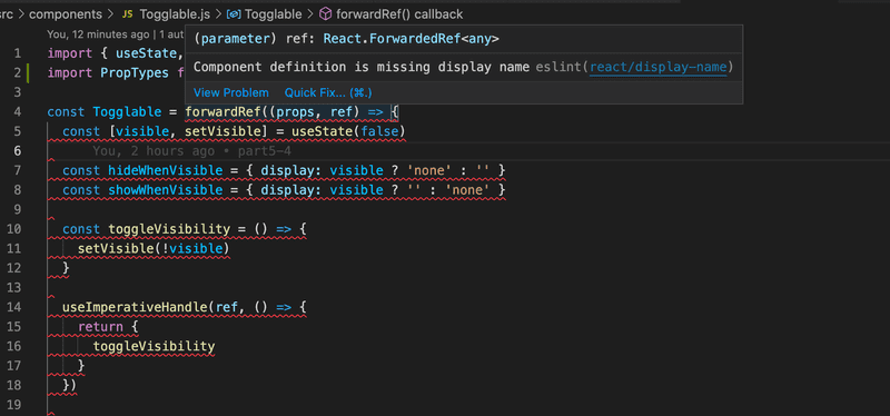
Component Togglable causes a nasty-looking warning Component definition is missing display name:
The react-devtools also reveals that the component does not have a name:
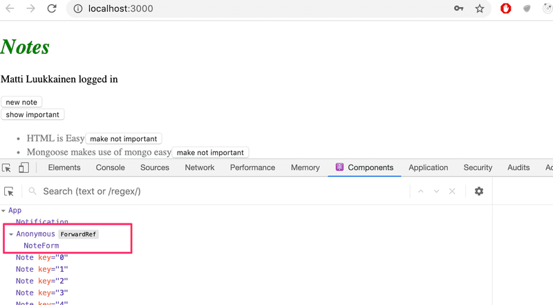
Fortunately, this is easy to fix
import { useState, useImperativeHandle } from 'react'
import PropTypes from 'prop-types'

const Togglable = React.forwardRef((props, ref) => {
  // ...
})

Togglable.displayName = 'Togglable'
export default Togglable
You can find the code for our current application in its entirety in the part5-7 branch of this GitHub repository.
Note that create-react-app has also a default ESLint-configuration, that we have now overridden. The documentation mentions that it is ok to replace the default but does not encourage us to do so: We highly recommend extending the base config, as removing it could introduce hard-to-find issues.

